Let’s face it, robots are going to take over the world.

With moves like those, it’s inevitable. So stop trying to fight it, and embrace all robots have to offer. Like sweet, sweet machine learning algorithms.
Case in point: Google’s Responsive Display Ads.
These display ads are automatically created by Google using its game-changing machine learning. We know what you’re thinking. But robots!
Don’t worry.
There is still use for you as a human. Because Google Display Ads work best when you (a human) provide its algorithms with the right kind of assets. Not to mention, provide strategy and management once the ads are up. Robots can do a lot, but they can’t do it all, after all.
Below we’re going to share 21 Responsive Display Ads best practices to ensure your assets have the right stuff, and the display ads Google’s robot AI creates for you perform at the best level possible.
What Exactly is a Google Responsive Display Ad?
Google Responsive Display Ads are ads created by Google automatically using assets that you provide. These assets include:
- Long Headline
- Short Headline
- Description
- Images (or video)
- Your logo
Google then takes those individual assets, combines them into countless variations, and sends them out across the Google Display Network. Like this:
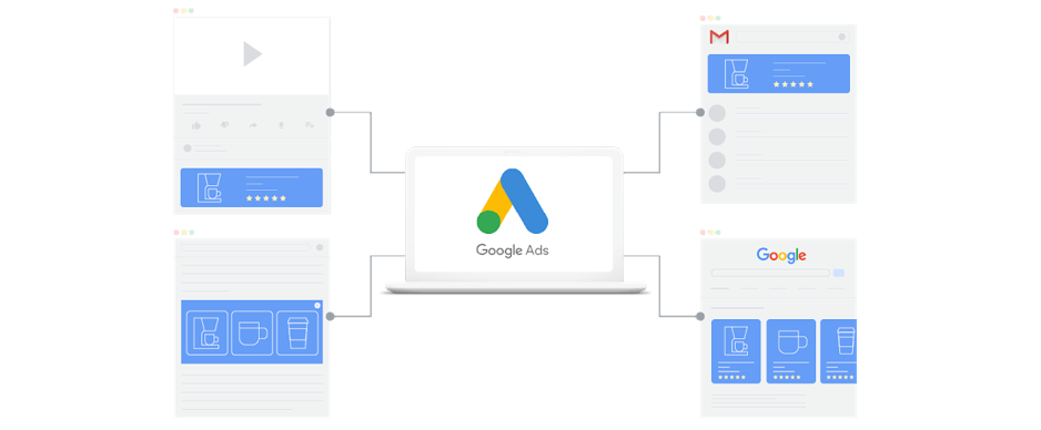
The Google Display Network is a group of over three million websites, news pages, and blogs, as well over 650,000 apps, where your ads can appear. By tapping into this network, you can reach people while they’re browsing their favorite websites, watching YouTube videos, checking their Gmail, or using an app.
Best of all, Google will automatically adjust the size, appearance, and format of your assets to fit the available ad space in each of these locations. Which is why they’re called “responsive.”
Avoid This Mistake When Creating Responsive Display Ads
With all this AI and robot talk, it’s easy to get complacent and think ‘I’ll just let the robots handle this.” And like we mentioned before, the use of AI is AMAZING…but it does not replace the need for human touch.
So while the end result created by Google can be amazing, it will only be as amazing as the assets you provide at the start.
So what’s the mistake to avoid?
Not doing your due diligence upfront, and failing to follow responsive display advertising best practices.
21 Best Practices for Google Display Ads
To ensure you don’t make the mistake we just mentioned above, here are some important Google Display Ads guidelines, shared by the pros from our PPC team, to follow. These will help ensure your assets work together in any and all configurations Google might conjure for your responsive display ads.
1. Adhere to Google’s Ad Policies
First and foremost, you need to make sure your ads comply with Google Ads Policies. Chances are you’re not going to read those. We get it. Disclaimers are super boring. So in a nutshell, don’t be gimmicky or deceptive and you’ll likely be okay.
2. Upload at Least 3-5 Images
Responsive display ads require a minimum of two images and allow up to 15 assets. While you should add as many assets as you can that work for your ad messaging, at the very least we recommend providing no less than 3-5 images.
3. Be Mindful of Aspect Ratios for Images
Google allows two aspect ratios for image assets.
- 91:1 (landscape)
- 1:1 (square)
One of your images MUST have an aspect ratio of 1.91:1. The rest can use either of the two.

Please note that landscape images must have a minimum size of 600×314 and square images must have a minimum size of 300×300. After you upload your images, Google will resize them in order to fit particular ad sizes.
4. Be Mindful of Aspect Ratios for Logos
Google requires different aspect ratios for logos, than images. Logos must be sized to one of the following:
- 4:1 (landscape)
- 1:1 (square)
It is preferable to upload logos sized to each of those aspect ratios. However, if you can only upload a single version of your logo, prioritize a 1:1 logo.

Although landscape logos can have a minimum size of 512×128, and square logos a minimum size of 128×128, we recommend you upload logos sized either to 1200×300 (for landscape) or 1200×1200 (for square) to ensure they appear at the highest quality.

5. Upload Transparent Logos, If Possible
To give Google the most flexibility when automatically creating your display ads, and ensure they look as good as possible across all configurations, it is ideal if your logo is uploaded with a transparent background.
White backgrounds are also acceptable. Anything else (like colored backgrounds) should NOT be used.
6. Be Mindful of the Space Around Your Logo
The white space, or padding, around your logo should be 1/16th of the logo size. For those of who you hate math, this means that your logo shouldn’t abutt the edges of your image (like the examples in #4) but should be centered with some (not a lot) of white space surrounding it.
7. Use the Right File Type for Images and Logos
Make sure your image and logo assets are one of the following formats.
- JPG
- PNG
- GIF (not animated)
That means no TIFFs, PDFs, SVGs, WebPs, animated GIFs, BMPs or any other combination of letters that you can imagine other than the three listed above.
8. Keep File Size Under 5mb
You cannot upload assets larger than 5mb. This hopefully shouldn’t be an issue with your logos and images (which should almost always be under 1mb), but if you’re uploading a video there is a chance it could be too large to be accepted.
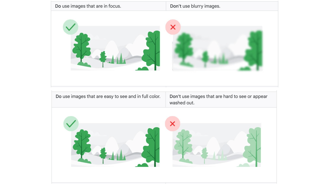
9. Don’t Use Blurry Images
Images are the most crucial element of responsive display ads. It is critical that they appear in the highest quality possible. The success of your ad depends on it. So make sure your images are as clear as possible.
This also means not using images that are full of color and easy to see. Not washed out, saturated, or using a low opacity.
10. Avoid Images with Borders
Your images should appear at the very edge of the composition, and borders should be transparent and square (i.e. not rounded).

11. Avoid Using Filters
The image assets you use should be uploaded in their original color composition. Meaning you have not inverted their colors or used filters excessively to change the color tone.

12. Do Not Overlay Your Logo
Don’t overlay a logo on top of an image that you upload. This could cause repetition and visual confusion, as Google will in some ad layouts automatically overlay your logo asset over your separate image assets. If you have an image where the logo is organically integrated into the photograph, then you can use it. Just be aware your logo may appear multiple times in certain layouts.
13. Do Not Overlay Text
Avoid inserting text on top of an image. When assets are automatically combined by Google, layouts will vary so you don’t know exactly how that text will appear and your messaging can become repetitive when put alongside your headline and description. Text can also become unreadable in smaller ad sizes.
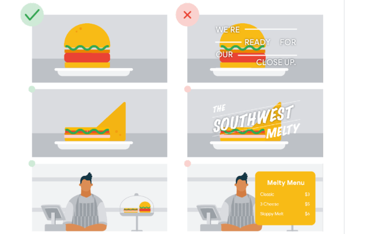
You can however use text that is naturally embedded or integrated in an image. But if you need to do so, we recommend that 20% or less of the display asset be text.
14. Do Not Overlay Buttons
Do not use button graphics within your images. Only use the original image.
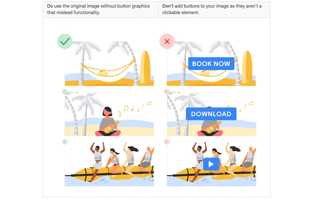
Remember those policies from above? Buttons that promise non-existent functionality are one of the deceptive practices that go against Google standards. Similarly, do NOT use text like “Play” or “Download” anywhere in the display ad.
15. Focus Images Around Your Product and Services
The product or service you are promoting should be the main focus of your asset. As a rule of thumb, blank space should not take up more than 80% of the image.

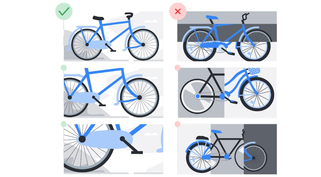
16. Don’t Use Collages
Use a single image per asset. Meaning don’t upload a single asset that contains a collage of images (i.e. multiple images in the same composition).
17. Avoid Generic, Click-Bait Messaging
Your headlines and descriptions should use clear, compelling, simple text to describe your product, service or brand. Descriptions have an 80-character limit so it is important to convey a complete message concisely.
- Bad Example
- Headline: TitanBOT
- Description: CLICK HERE to learn more!
- Good Example
- Headline: Get better SEO insight with TitanBOT
- Description: Setup a free demo to find opportunities for your site today.
Your text should use sentence case and avoid the use of ALL CAPS.
18. Include Prices, Promotions and Exclusives
Don’t make your ad mysterious. Provide as much useful information via your headlines and description as you can. Your audience is more likely to click your ad if they can make an immediate, informed decision about what you’re promoting. This includes inserting pricing info, promo codes, and using terms like “special offer,” “coupon”, and “discount” when relevant.
19. Ensure Your Landing Page Matches Your Ad Text
In addition to providing the assets listed above to Google, you’ll also need to share a landing page for the ad to point to. Your landing page’s copy and call-to-action need to match the text of your ad. If your ad text says “one day sale” then your landing page should be about that one-day sale. If your ad says “take a demo,” then your landing page should let users sign up for a demo.
20. Take Advantage of Auto-Generated Videos
Google responsive display ads come with an advanced format option to automatically generate videos using your assets. When selected, Google will create a video by combining your images, logo and text assets.

To create an auto-generated video you need to upload at least one log and either 3 landscape images, or 4 square images.
21. Set Up Dynamic Remarketing for Display Ads
Google makes it really easy to turn your responsive display ads into retargeting ads. All you need to do is attach a feed (i.e. database of your products and services) to your campaigns. Then let Google take care of the rest. Learn more about how to create a feed for responsive ads.
You + Google’s Display Algorithms = Perfect Match
Despite how efficiently Google can automatically generate countless, beautiful looking ads, there’s still a need for a human’s touch. Otherwise the assets you upload to Google won’t be up to snuff, and your responsive display ads will underperform.
The Google Display Network reaches over 90% of Internet users worldwide. Their responsive display ads are a great way to tap into that network. With a stat like that, it would be silly not to give display ads a try. Just make sure when you do, you follow the responsive display ads best practices listed above.
And buy your creative team something nice. Because you’re going to need their help. And once your ads are up, give us a call. And we’ll help you maximize your ad performance further. We’re all about working with robots.


