Is your website not performing as well as you would like in search, even though you’ve researched keywords like a pro and optimized with gusto? The culprit holding you back from SEO success could be your site structure. Or lack thereof.
Remember when we learned how to write reports in school? With their bibliographies and double spaces. It was probably one of the most boring lessons ever learned – right up there with calculus and why we shouldn’t eat paste.

But hopefully, you paid attention because all that report prep is about to come in handy.
Or at least one part of it. Thanks to this bubbly beauty…
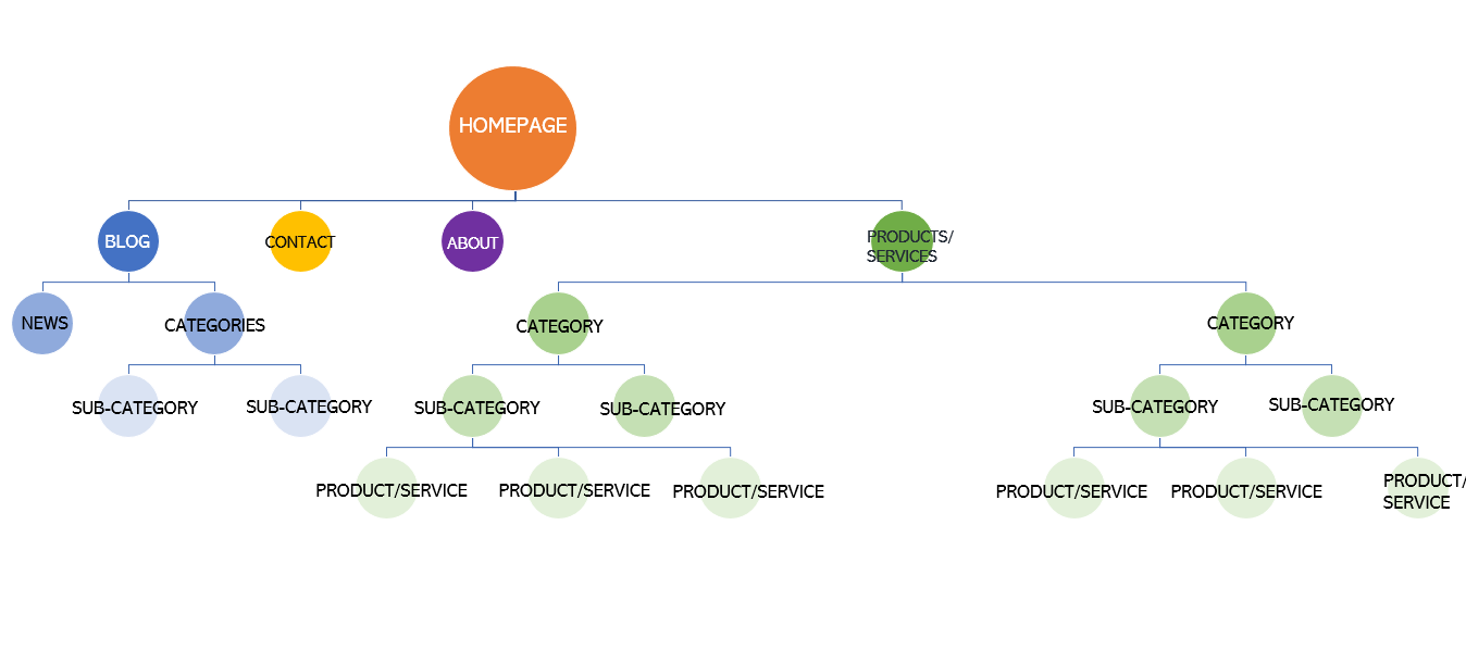
The website outline. As majestic as it is useful.
Just look at those wonderful lines and circles, creating the ultimate hierarchy. It is site success personified. How so, you ask? Because by invoking this neatly organized topical framework, we are going to architect your site right into the upper SEO echelons.
Why We Should Care About Site Structure
Site structure is the unsung hero of SEO. It might not be as flashy as a video header or as sexy as JSON-LD, but it is one of the most crucial aspects of a site’s SEO performance.
Web designers often don’t give much consideration to SEO. (No offense designers.) They are more concerned with making your site look amazing.
That’s where SEO strategists come in. They focus on making your site act amazing.
Yet, with all the emphasis placed on SEO these days, and even in situations where web designers and SEO strategists are working seamlessly together, it’s surprising how often we still see businesses overlook their website’s architecture.
Most likely, the reason is, despite its epic importance, few fully understand (designers, strategists, or otherwise) how a great site structure can blow the roof off their SEO.
Consider yourself not one of them.

What is Site Structure
Site structure (or website architecture) is the layout of a website’s pages, outlining their hierarchy and how they link together.
In organizing a website’s content, site structure serves two primary purposes:
- User Experience (UX): Make it easy for users to navigate a site and find what they’re looking for.
- SEO: Make it easy for search engine bots to crawl a site and index pages.
You should always build a site with both of these in mind.
When done well, no matter where a user and crawler find themselves on your site, they will know:
- What Do I Do Here?
- Where Do I Go Next?
When done poorly, a user and crawler will want to punch your website in the face for being so confusing. And will then go check out your competitors.
Why Site Structure Matters for SEO
Well-developed site architecture is a foundation of SEO.
Without a good site structure, your SEO will never succeed. With a great site structure, your SEO can rock the socks off the Internet.
A great site structure:
- Helps search engines understand (and index) your pages.
- Helps search engines prioritize (and discover) your most important pages.
- Helps users find (and engage) with your pages.
- Helps spread link equity (ranking power) across your pages.
- Helps the Internet get its socks rocked off by your pages.
But that’s not all!
The right site structure will also lay the groundwork for generating some kickass site links.
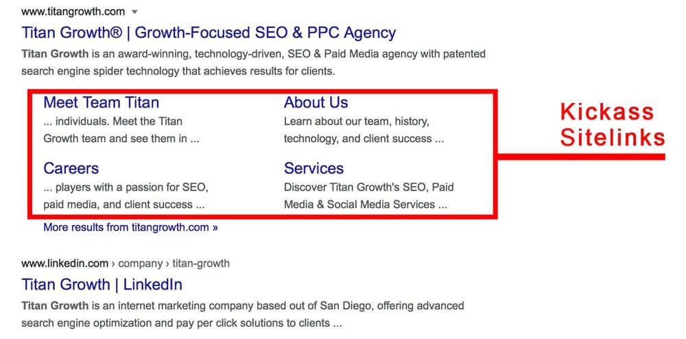
Sitelinks increase your SERP real estate, web traffic, CTRs, conversions, and all-around SEO performance. But you don’t just send Google a nice letter and some sweet chocolates requesting sitelinks. They generate sitelinks automatically based on your site structure. To review: Bad site structure, no sitelinks. Great site structure, kickass sitelinks.
But don’t just take our word for it. Below is an explanation straight from Google themselves:
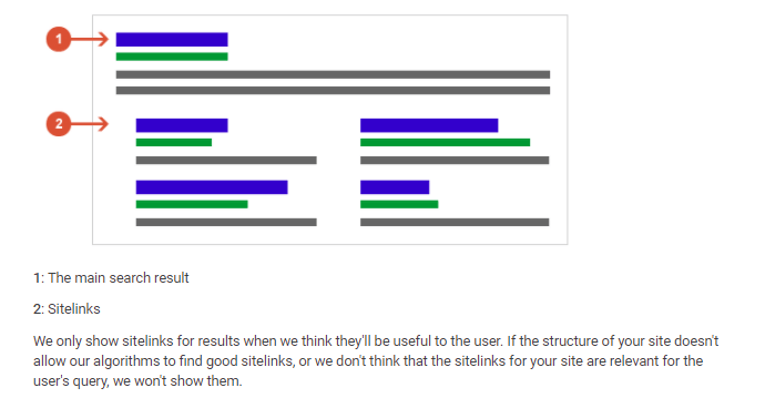
Overall, your website’s architecture is the backbone of your SEO. Can you function without a backbone? Neither can your website. So, you’d better have one that’s up to snuff.
What Goes into a Great Site Structure?
There are several assets that all awesomely structured websites possess.
- Idiot Proofing: Users shouldn’t have to think too much. They should know ‘What Do I Do Here?’ or ‘Where Do I Go Next?’ on every page.
- 3 Clicks or Less: A user (and crawler) should be able to access every page of your site in 3 clicks or less, whether your site has three pages or three million.
- Unique, Simple URLs: Every page should have a URL that describes what the page is about in as few words as possible.
- Internal Links Galore: Every page should have at least one link to and one link from another page.
- Logical Flow: Every page should flow into one another in a way that makes sense and is relevant to user experience.
The good news? Your site’s architecture can harness the power of these assets to rank with the greats.
Anyone can develop a baller site structure that tickles the fancy of both users and search engines. It just takes some forethought, planning, and a little know-how.
So, grab your digital L-square and coding compass because we’re about to structure your website like a pro.
Design a Baller Site Structure in 5 Easy Steps
1. Plan Ahead
The best time to outline your site structure is long before your team puts a finger to the keyboard and develops your site; before there are any pages, any CMS, any domain. Just your amazing business ideas, hopes, and dreams.
But wait, Team Titan, what if I already have a live website? Am I too late?
Not by a long shot. It’s never too late to rock the socks off the Internet. Or plan ahead.
While designing a layout is certainly best done when developing your website from scratch, you can still streamline your site structure at any time.
In fact, few sites start off being complicated.
It’s only after an extended period of time existing on the World Wide Web that their architecture starts to crumble. The need to add more content, more categories, more pages, and more links can cause any site to go astray. Resulting in something akin to this…
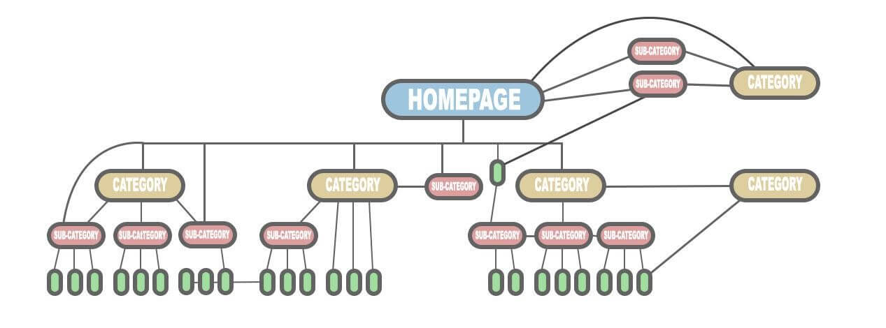
That’s a poor site architecture. It’s a hot mess.
If you plan ahead, your site doesn’t have to turn into that tangled heap.
Regardless if you start from scratch, redesign your entire site, or just move around a few key pages, you can get there.
Visualize your site’s layout, and outline how you will implement future additions, so your SEO will stay strong in the long term. Whatever you come up with, just be sure to stick with it. Whenever you have to add something entirely new to your site, it should fit within your current layout scheme.
Whiteboards, sticky notes, spreadsheets, and Cheez-Its will all become your best friends when planning your site’s structure. When all is said and done, you will be left with a hierarchy that is clean, straightforward, and makes sense.
2. Keep Your Site Shallow
Here is an ideal website architecture:
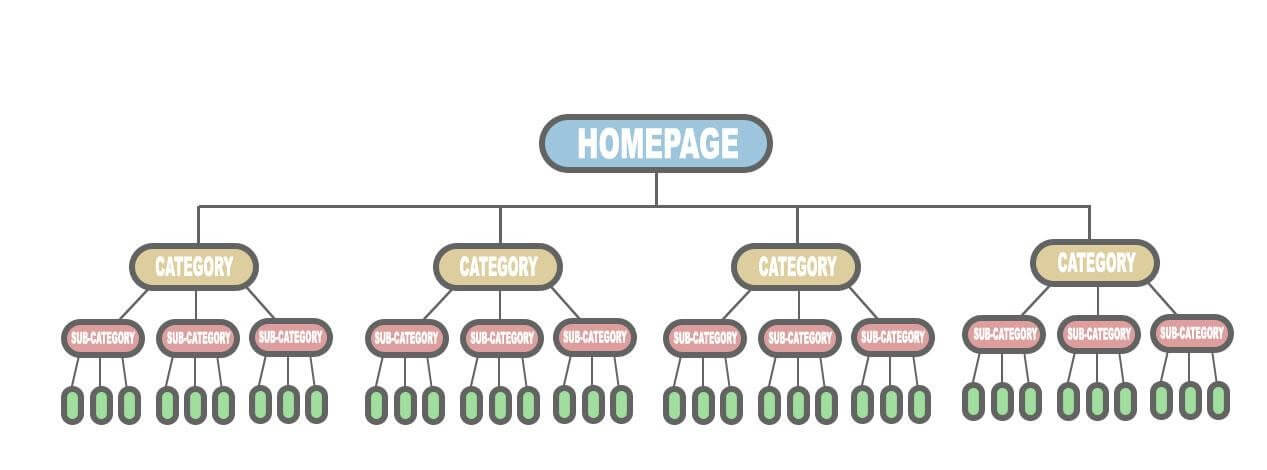
Clean cut and dignified.
That’s the type of site you’d take home to meet your mother.
(Remember, how we said learning how to write a report would eventually pay off? That’s right. Site structure is nothing more than a well-developed web outline. See! All that stuff you learned in school wasn’t a complete waste of time.)
Imagine your well-organized website as a hierarchy:
- Level 1: Homepage
- Level 2: Category Pages
- Level 3. Sub-categories
- Level 4: Supporting pages or posts
(If you have a smaller site, you probably only need three levels, and can skip having sub-categories.)
This type of layout is referred to as a “flat site architecture,” or shallow architecture.
A flat site structure means users (and search engine crawlers) can reach any page on your site within three clicks or less. (As opposed to a “deep” site structure, requiring 4+ clicks to reach a page.)
An ideal site layout creates as few links between top-level pages and lower-level pages as possible and maintains a hierarchical order.
This, in turn, generates link equity. Link equity juices up each page’s ranking potential to the max. That’s a good thing. A really good thing.
3. Create a Simple URL Structure
The three main components of website architecture are:
- Site Hierarchy
- URL Structure
- Internal Links
We just covered the first. Now let’s conquer the second.
Actually, this is pretty easy to do if you’ve already taken the time to develop a logical, flat site hierarchy. That’s because site hierarchy dictates URL structure.
Here’s what a sound URL structure looks like:
https://example.com/category/subcategory/page-name
Your URLs don’t have to look exactly like that (e.g. they might not have a subcategory), but they should follow this same, basic structure.
One important thing to note: The “page-name” doesn’t have to be the entire page name or blog title. In fact, it’s often better for SEO when it is not.
Page-name can be an abbreviated version, trimming down the title, removing gap words, and isolating relevant keywords. (Also avoid using symbols and irrelevant numbers.)
As an example, check out the URL for this article:
https://www.titangrowth.com/blog/site-structure-seo-920/
Invoking our website’s site hierarchy, this URL contains:
- Level 1: Homepage (titangrowth.com)
- Level 2: Category Page (blog/)
- Level 3: Post (site-structure-seo/) + a numeric tag we use for internal tagging
BOOM!
Two clicks in, and visitors are learning how to boost their SEO via site structure. You’re welcome Internet.
Notice how this URL doesn’t include the entire title of this post. That’s because having crawlers scan “https://www.titangrowth.com/blog/site-structure-the-foundation-to-a-successful-seo-strategy/” in our URL doesn’t do our SEO any favors. Web crawlers have better things to do than read your unnecessarily long URLs. All search engines care about is what the page is about. So, make it as easy possible for them to figure it out.
Moral of this story: A sweet and simple URL structure is the way to go.
4. Connect Your Pages with Internal Linking
An SEO-friendly site architecture uses internal links. Lots and lots of internal links.
If your hierarchy is the backbone of your site, then internal linking is the meat on those bones.
SERPs love sites with meaty bones.
Your website’s entire SEO success depends on how effectively your pages are linked together.
Internal links are hyperlinks that connect a page on your domain to another page on the same domain. (As opposed to external links, which link a page on your domain to another page on a different domain.)
In SEO, internal linking serves two purposes:
- Shows search engines how to get to pages on your site.
- Tells search engines which pages are most important.
For all pages that you want to be indexed by a search engine, we recommend following three rules:
- Internal Linking Rule #1: Every page on your website should have a link that points to another page on your website.
- Internal Linking Rule #2: Every page on your website should have a link that points to it from another page on your website.
- Internal Linking Rule #3: Link to your most important pages more than you do your less important pages
Prioritizing which pages appear in search results (and optimizing your crawl budget) is one of the primary goals of SEO. The internal link network of your site structure will determine both.
Which is why it is so important that you prioritize internally linking to your most important pages—the ones you want ranking highest in search engines.
5. Form a Clear (HTML-Based) Navigation Path
In the final step of designing a baller site structure, let’s tie it all together. That means seamlessly incorporating the three components of website architecture…
- Site Hierarchy
- URL Structure
- Internal Links
….into a user-friendly, and crawler-friendly, experience. The final result will be a clear navigation path throughout your website.
In this article’s case, that path is:
Homepage > Blog > This Article
Your navigation path acts as a guide for search engine crawlers around your website. The easier they can navigate your pages, the easier they can index and rank your pages.
The most important tool in forming your navigation path is your main menu.
The main menu does not have to contain every page of your website. In fact, it should definitely not do that. The main menu should only list your main, most important pages. These will typically be your Level 2: Category pages. And not even all of them.
A good rule of thumb is to limit your main menu to 3-7 top-level items.
Here’s our main menu as an example:

It uses seven top-level items.
These mirror our site’s hierarchy – with each top-level item corresponding to one of our category pages.
You’ll notice that our main menu doesn’t include ALL of our category pages. For instance, the Resources category page is not included. With limited real estate, the items in our main menu are the ones most important (and useful) to our business, and valuable to our visitors right now.
Although we don’t use one, much larger sites will sometimes implement a dropdown menu. Dropdown menus should be minimal. Their second-level menu items should correspond to Level 3: Sub-categories. There is rarely ever any need to go any deeper than that in a menu.
Why are minimal menus so crucial?
Because the more links you add to a menu, the less valuable they become to both users and search engines.
By limiting your menu items, you are signaling to search engines which pages are most important, and which you would like to prioritize for search rank.
To further keep things simple, only use HTML and CSS for navigation links. (JavaScript links can really screw with crawlers.)
(You’ll notice in our menu there only appears to be six items. We used CSS to make the 7th “Contact Us” menu item look like a button.)

While the main menu will form your primary navigation path, another useful navigation path for SEO are breadcrumbs.
Breadcrumbs dumb down your site structure into the simplest terms possible. They are clickable HTML links that usually appear at the top of a page showing the path to that page. You commonly see them on large e-commerce sites.

A lot of web developers don’t use breadcrumbs because they don’t jive with design, but if you want to dominate SEO, you could give them a try. At the end of the day, users care less about fancy design than you might think. All they really care about is getting the information they need.
To that end, if you take away one thing from our little talk about site structure here today, remember: Ease of use will always trump bells and whistles.
Great SEO Starts with a Great Site Structure
It is very easy to overcomplicate site structure.
Sure, many nuanced tactics go into improving a site’s structure and SEO. Still, too often webmasters spend all their time chasing after some of the less important ones, while completely ignoring the most impactful.
Site structure is one of the more impactful SEO tactics. If not the most impactful. Second perhaps only to page structure.
Yet site structure is also one of the most overlooked.
So, our first recommendation is to give your site structure the attention it deserves.
Our second recommendation is not to make it more complicated than it needs to be.
We’re talking grade school easy.
On par with the outline that little Johnny Fourth Grader filled in to organize his thoughts for his paper on “Why Dinosaurs are Cool.” (They are big, have weird skin, can sometimes fly, and hang out with Chris Pratt.)

It’s as simple as that.
So why is your website so cool?
Show the Internet why with your site structure.
(We’d also personally love to see your cool site structure. We love looking at cool sites. So share it with us. Don’t be shy. If you’re feeling insecure about the coolness of your site structure, no worries. We’re also here to help. Sometimes it just takes a little site restructuring to show it. We’re all about making cool sites even cooler. We bet we can help make your site the coolest site in search. Like dinosaur-level cool. It doesn’t get any cooler than that.)

